
Extreme numbers
In everyday life, the numbers we need to use are well represented by the familiar hundreds, tens and units notation: 20 kilos, 500 miles, 0.25% interest. Science on the other hand deals with extreme numbers routinely. The speed of light in 186,000,000 miles per second, the age of the Earth 4.54 billion years, the width of a hair 0.1 millimetres, the size of an atom 0.0000001 millimetres. It’s not only hard to read or even say these numbers out loud; it’s hard to compare them with one another. So scientists use a notation that counts the number of 0s and denotes this with a small raised-up number called the exponent:
102 is 100 ( two noughts)
105 is 100000 (five noughts) and so on
To deal with fractions – numbers less than one – the negative sign is put before the exponent and the 0 before the dot is counted.
10-2 is 0.01
10-5 is 0.00001
This way we can quickly grasp the rapid growth of infection for example. If the number grows from 104 to 105 its gone up ten times.
Logarithms
The bane of student lives decades ago, logarithms are largely forgotten today, thankfully. The “log tables” students once had to use to multiply large numbers have been replaced by calculators. But it’s still worth knowing the key point about logarithms. They help us grapple with extremes types of change and extreme numbers. The logarithm of a number is simply another word for the little number – the exponent.
Thus the logarithm of 102 is 2; the log of 105 is 5. Simple as that. As these example have 10 as the base, they are called ‘base 10’ logarithms.
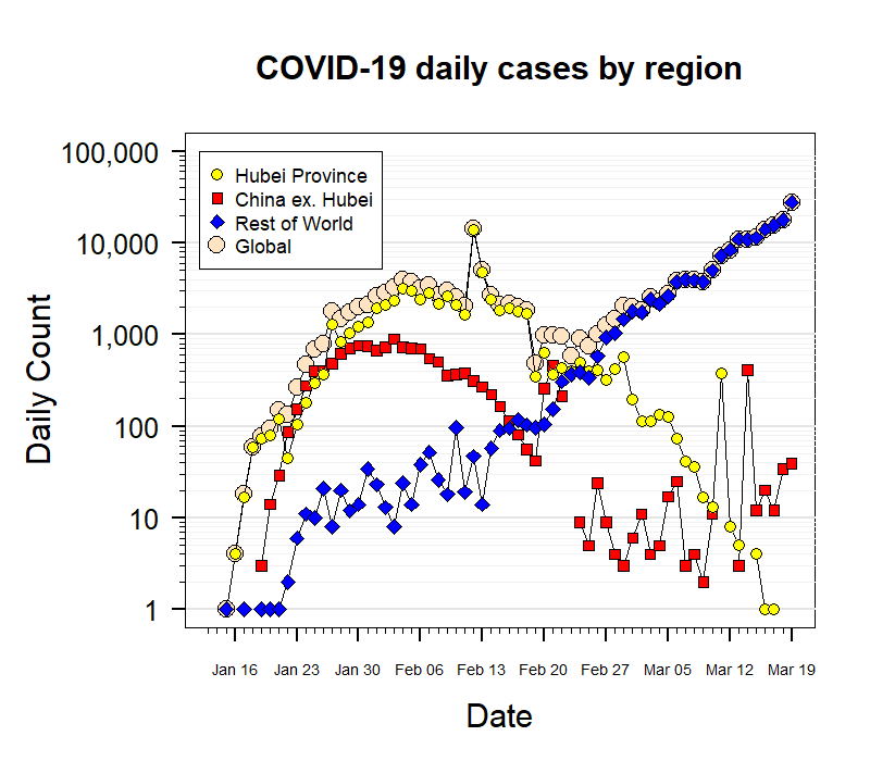
So to check whether an epidemic is growing exponentially we simply look to see if the little numbers, the exponents, are going up steadily. In this graph of COVID 19 cases in various regions, take a look at the blue line, it’s roughly straight, at least it is from Feb 20th onwards.
But then look at the vertical axis – it goes up by multiples of 10 each step, rather than just by the addition of ten. In other words the steps on the axis are 101 102 103 104 – just count the noughts to check. This a so-called “logarithmic” graph because it’s the small numbers or logarithms 1, 2, 3, 4, 5 that are spaced equally along the vertical axis. This graph shows that roughly from 23rd January and, more clearly, from 20th February the epidemic was following a straight line path when plotted using logarithms. This is the proof that it was indeed growing exponentially in the “rest of the world” during this period.
Estimation and approximations
Maths tends to come across as about precision, exact answers. While it’s true that exact relationships are the hallmark of arithmetic, algebra and geometry, it’s a pity the areas of maths dealing with less precise things get less publicity. After all the world in which we live our lives is dominated by uncertainty and imprecision – think of economics, the weather, child rearing, gardening and so on. So here are a couple of points on this theme.
Knowing the exact square meterage of a house is important to a surveyor, as the precise calorific value of yogurt is for the nutritionist. But for the rest of us, it’s far more important to get a rough idea of quantities. We need to know roughly how much carpet to order for the living room or how to keep our calorific intake within reasonable limits. Estimating can be done in myriad ways. You can pace out your floorspace, for example, or gauge the distance you’ve walked by checking the length of your stride then counting steps.
Rough calculations can be done with complicated numbers by rounding up or down. For example, mortgage repayments on a loan of £190,000 at an interest rate of 3.8% could be approximated using the figures 200,000 x 4/100 i.e. £8,000 p.a. You can even go a step further and see that this will be on the high side as both figures have been rounded upwards rather than down.
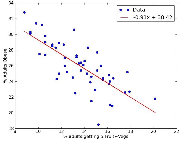
In real-world situations, things don’t usually follow a mathematical curve exactly. This graph links the percentage of people who are obese (vertical) with the percentage who eat five portions of fruit and veg a day (horizontal). The points are scattered around, showing there is not an exact relationship between the two. Nevertheless a distinct trend can be seen, demonstrating that those eating healthily tend to be less obese.
Mathematically, a line can be found that fits the scatter of points with the least amount of deviation. The steepness of the line can be calculated to give an indication of how important the link is. Some individual cases will lie above and some below this line. Dots below the line could be used as examples to show that some groups are not obese even though they eat little fruit and veg. Propagandists may be tempted to select individual cases in order to mislead people about a trend. For public policy purposes, overall trends are vitally important.
The earlier graph showing COVID-19 infection rates has just such a scatter. To try to work out a theory of the spread of the infection mathematical models are developed and then tested to see how well they fit the real-world data. This underlines the importance of mathematical techniques that deal with the roughness of real events and use approximation and estimation to discern trends and scenarios. Weather forecasting is a prime example.
Mathematical Modelling
Mathematical modelling is being used extensively to develop advice about the progression of the COVID – 19 pandemic. The approach uses mathematical equations to simulate real-life situations based on reasonable assumptions that modellers set out. It is most useful when sufficient actual data are not available, as with this unprecedented coronavirus. A good example is the COVID Symptom Tracker study set up by a consortium involving Kings College London and ZOE, a global health science company. The group rapidly created an app through which around 2 million people in the UK are contributing data about their symptoms every day.
The team uses mathematical modelling to estimate the number of people infected across the UK, even though only a tiny fraction of the population has actually been tested. They have done this by analysing symptoms reported by the small number of people in their study (1702) who have already been tested for COVID-19. They found the main symptom that distinguished the positive from the negative people was loss of smell and taste. They were able to assign a “weight” to each kind of symptom according to how often it was reported in this small group. They then applied these weights to the much larger group of people who had reported symptoms of one kind or another (400,000).
By this means they were able to estimate which of the 400,000 people reporting their various symptoms had actually had the infection. Some probably had the COVID infection, some had something else. From this they were able to estimate the percentage of the population that had had the infection, even though the test for this is still not widely available. Because the number of people in the study is so large they were even able to estimate the likely number of infections in each region of the UK and produce this map.
The progression of the disease day by day can also be estimated in this study because the participants are reporting their symptoms every day. The dramatic drop in estimated infection rates can be seen in this animated graph. The prediction is that the number of new cases estimated on each day has fallen from 2 million to 582,640 in just over two weeks (01 April to 15 April) – a drop of some 70 % since the peak. The researchers advise that “the data tell us is that there is still a large number of infectious people in the UK with mild symptoms, so to quickly lift the lockdown would not be appropriate”.
Modelling has been used by teams across the world for many different kinds of estimate, for example:
- the rate at which the disease is transmitted from person to person
- the rate of global spread
- the effectiveness of screening at borders
Fortunately mathematical models and other types of scientific research are usually (though not always) shared on a global basis. This tradition is of enormous value for a pandemic and it demonstrates how matters affecting the whole planet need to be handled. Modelling is a marvellous approach that brings mathematics alive by applying it to real, everyday situations. It’s a pity it is so under-represented in school curricula.
© Andrew Morris 18th April 2020
