
Probability
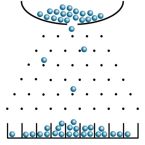
This image of ball bearings falling through a maze of pins reminds us just how strange the play of chance is. The balls hit the pins and bounce off in random directions. By the time they reach the bottom each would have made a series of contacts, each one seemingly unpredictable. Yet, as they accumulate at the bottom, a clear pattern builds up. As the numbers increase so the pattern becomes clearer and clearer – more predictable, indeed.
This analogy underlines how unpredictable chance events can, in their multitudes, give rise to absolutely predictable patterns. Neither you nor I can say whether Nancy Jones or Rufus Merryweather will decide to catch the 8.15 from Surbiton tomorrow. But we can be sure the concourse of Waterloo station will be filled with more or less the same numbers as last week. Given a sufficiently large number of instances, the chances of unpredictable events can be accurately determined. That’s how casinos make their millions. On a more sombre note, it’s also how we can foresee the spread of diseases, even without knowing who will be afflicted
Solid though the mathematics of probability is, it’s hard for us to link it to our behaviour. One study estimated that 2 million people might have been infected at the peak on 1st April[i]. With a UK population of 66 million, this would mean approximately one person in 33 carried the bug on that day. Another study estimates your chances of dying once you are infected as around 0.5% -1%[ii]. A fit young person keen on going to a party or football match might well see a 0.0003 % chance of dying (3 in a million) as worth the risk.
However, if just three in a million people did get infected that day it could give rise to some two hundred needing intensive care a few weeks later. That’s a lot for one day. These rough figures are not official; they are chosen simply to illustrate the mathematical point. It’s very hard to connect the restrictions on your low risk behaviour with the certainty of high risk consequences for public services.
The mathematical point is that individual chance events can give rise to predictable patterns over large populations. Probability can seem counterintuitive.
Averages
The figures given above are, of course averages. That means they are found by totalling up the number of people affected and dividing by the total number in the group (or “population”) in question. It’s easy to apply averages inappropriately to individual cases. Just because 50.2% of 17 – 30 year olds in England went to university in 2018, for example, doesn’t mean a young person you know has a 50:50 chance of getting to university. That depends on a host of social, cultural, gender, genetic and regional factors. You would have to decide which ones seemed relevant in your case before using an all-England average.
For COVID, a team at Imperial College has calculated the following risks:
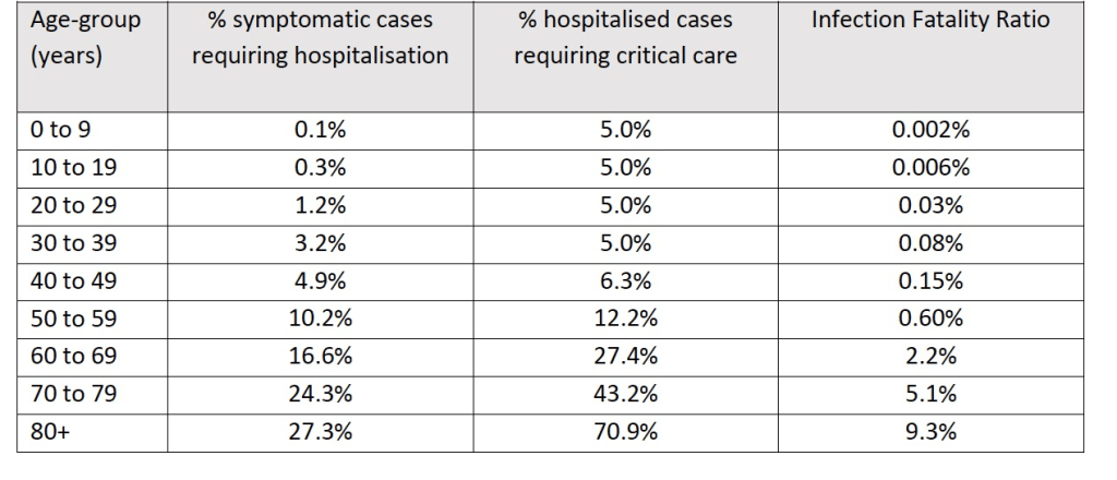
Clearly you should choose the average number appropriate to your age, before judging your personal level of risk.
Other factors, such as your general health, living conditions and social behaviour may well play a part too. These are the kinds of variable that epidemiologists research into. Averages reflect the nature of the population or group the researchers chose to study. This may or may not be relevant to you in particular.
Exponential growth
Changes over time are part of everyday experience: daylight comes and goes, seasons slowly pass and ships traverse the oceans. Some changes are steady but others are not. The timing of sunset and sunrise changes every day but near the solstice they hardly do so at all; at the equinox they move many minutes per day. A thirteen year old grows rapidly taller; an eighteen year old barely at all. Many changes are not uniform.
A steady ship on calm water, on the other hand, will cover roughly the same number of miles with every hour: the distance from its destination changes more or less regularly. In equal intervals of time it travels the same distance: in every hour it covers, say, 20 miles. The distance covered is added uniformly every hour.
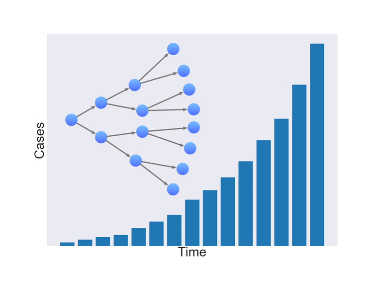
Some kinds of change are far more dramatic. A popular tweet might spread from its author to her ten followers, each of whom might re-tweet to ten of theirs, reaching a hundred more. Then a thousand, ten thousand and so on. The message will have “gone viral”. In equal intervals of time the number of re-tweets is not the same, it multiplies. This kind of growth is called exponential. The change multiplies in equal intervals of time rather than adds. Instead of 10 – 20 – 30 – 40 you have 10 – 100 – 1000 – 10,000….. or 2 – 4 – 8 – 16 – 32……
One way this kind of regular multiplication can be captured is by the small number regularly used to denote a “square” or “cube” as in 32 = 9 or 23 = 8. The number sequences above could be written more simply as:
10 102 103 104 or 2 22 23 24 25
The small number is known as an “exponent” – hence the name of this kind of growth: exponential.

It’s easy to see how this pattern of growth characterises the spread of a pandemic. If a carrier infects two people and they infect two more and so on, the total number multiplies exponentially, as the left hand side of this image shows. If instead each person was to infect ten, the growth would, of course, be far more rapid. In the case of COVID -19 the average number of people a carrier infects is thought to be between 2.0 and 2.5. For seasonal flu the figure is lower.
The exponential growth phase of epidemics doesn’t last forever. In a finite population the rate of growth of disease must eventually stop increasing as fewer and fewer people remain to be infected. The daily growth in numbers ceases to be exponential; it gradually diminishes from day to day, tending towards a steadier daily figure (the “plateau”) that doesn’t grow from day to day. Eventually the daily figure begins to fall, reaching a low or manageable number. Diseases may never be entirely eliminated from a population, as the continuing incidence of HIV and Ebola infection shows.
Graphs
The way changes occur over time is often most easily represented by a graph rather than a long series of numbers. Each bar in this chart is not only longer than the previous one but the diference between them is increasing. You can see that the steepness or gradient of the bar chart is rising as well as the height of the columns.
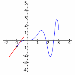
The way in which change occurs is the subject matter of calculus. It’s the branch of maths that helps us work out whether something is changing steadily or with increasing rapidity. It enables us to calculate the steepness of a curve and how it may be varying. This animation shows how the steepness of a curved line is represented by drawing a tangent at any point and seeing how steep that is.
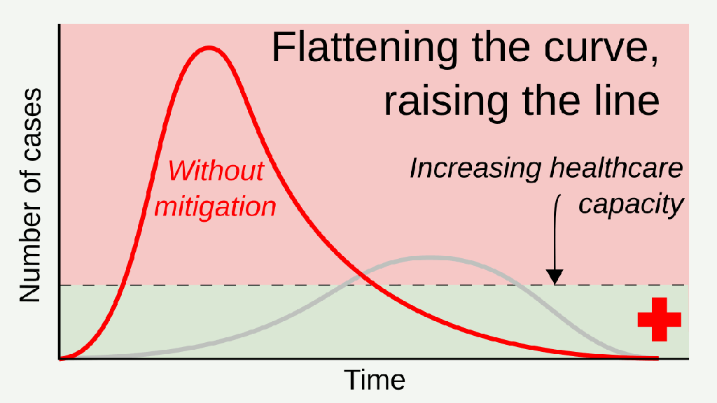
This graph was given extensive coverage as efforts were made to mitigate the pace of the epidemic. By starting from the far left you can see how the red line gets steeper and steeper initially – this is the “exponential growth” phase. It then settles to a fairly steady gradient before becoming less and less steep as it approaches the peak. For a moment, at the peak, it’s flat – the gradient is zero.
The gradient then reverses and becomes steeper in the downhill direction for a short period, before gradually flattening out.
The purpose of asking people to distance themselves from one another was to reduce the initial steepness of the curve and to slow down the way it gets steeper. This is done by reducing the number of people each of us is in contact with. In mathematical terms we are seeking an exponential growth more like 2-4-8-16 than 10-100-100-1000. What the experts call “reducing R0” (R0 is the reproduction number – how many others a person goes on to infect, on average).
Communicating about rates and graphs
The media are not always clear about relaying numbers or presenting graphs, I am afraid. If you end up feeling unsure it may not be your fault. As I write an Al Jazeera TV headline read: “The Asian economy comes to a halt” – really, no production, no farming, no food? They meant the rate of growth of the economy.
“Sadly, deaths have risen again in the past 24 hours”. This is not really news – we know deaths are going to increase – they do every day anyway. We also know for sure that the daily number of deaths currently will be greater due to COVID-19. What we wish to know about is the number of deaths per day – or the rate of deaths. The word “rate” is used to refer to numbers in a given period of time, not the total numbers. When I drive from home I am initially 10 miles away, then later, 20 miles away, then 30 and so on. Of course the distance is increasing; the important point is the rate. If it took 10 minutes to do 10 miles, the rate would be a mile a minute or 60 mph (on average).
A slightly more sophisticated question is whether the rate is itself steady or increasing or decreasing. If the car above was on a motorway doing a steady 60 mph, it’s rate of speed would not be changing. If it speeded up, its rate would increase 60 → 65 → 70 mph. That’s called acceleration.
The spread of COVID-19 infection presents the same issues. Yes – we may eventually want to know the total number of deaths; it may help us compare the severity of COVID-19 to the 1918/19 ‘flu pandemic. But for practical purposes now, hospitals and medical suppliers need to know the rate of infection – how many per day. It helps them plan their daily procedures admitting patients, ordering supplies, manufacturing PPE.
Governments also need to prepare the future strategy; they not only need to know the daily rate – they also need to know whether the daily rate is increasing or decreasing. To project forward effectively they also ought to know how steep the increase or decree is – whether the epidemic is accelerating or decelerating. That’s why the statisticians will be doing a lot of calculus!
Meanwhile the media could help us all by following basic protocols when explain graphs.
- First – tell us what is being represented – is it deaths, daily death rate, increases in daily death rate, for example?
- Second – tell us what is represent horizontally. Is it calendar dates or the time elapsed since the outbreak started? Is it in days, weeks or months?
- Third – tell us where it starts. Was it the beginning of the UK outbreak or just the last week or month?
- Fourth tell us about the vertical axis – does it start from zero? Is it in thousands or hundreds? In some cases – is it logarithmic (see below).
This blog doesn’t attempt to explain the mathematics behind epidemics in depth. It simply opens up some aspects of the relevant maths in the hope that it might dispel a few myths and inspire further enquiry. Maths divides people, in my experience. As adults, some wish they’d had a more positive experience of the subject earlier on and want to remedy this as adults; others just dislike it! For readers with more appetite, read on…
© Andrew Morris 18th April 2020
Read more ……. on extreme numbers… estimation …. mathematical modelling
